STATISTICS AND ANALYSES
4.7
Graphics with R
In this article we introduce you to plotting with R. It is always a good idea to first look at your data before you run statistical tests. Keep in mind, that using graphs, charts and images help your audience to understand the data more quickly.
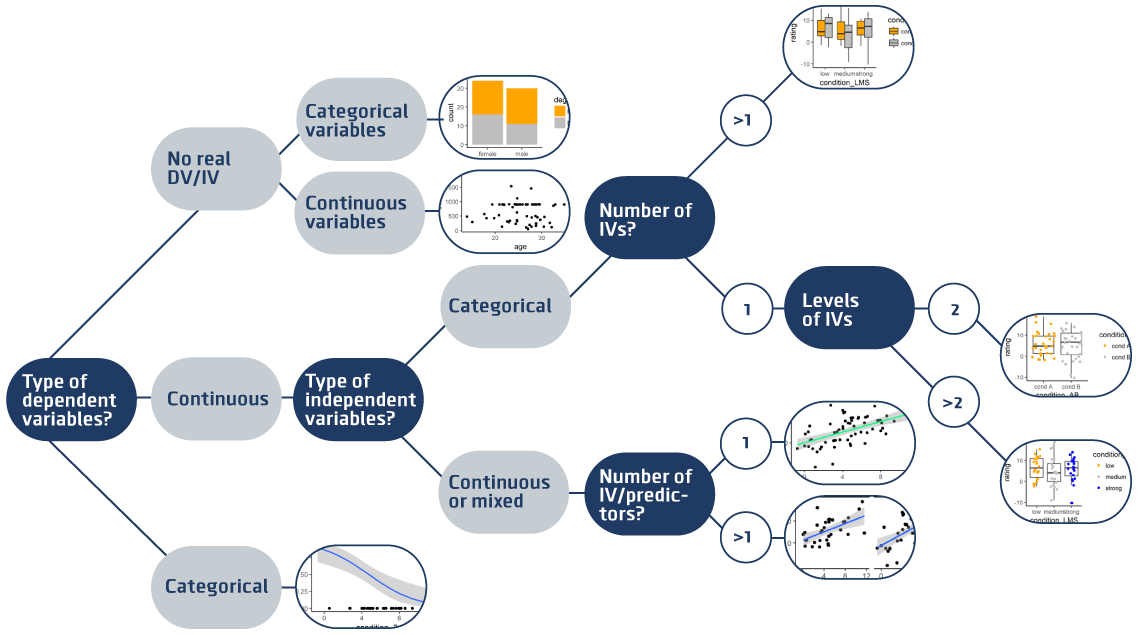
This is a brief illustration of the types of plots you can use for different experimental designs:
The following examples show your R code for different types of plots.
We use a package called ggplot, which you need to install once and then you can load it every time you need to use it:
install.packages("ggplot2") #run this only ONE TIME  then comment it out (it's like installing a program)
library(ggplot2) #run this every time, it's like opening a program
theme_set(theme_classic()) # This comment defines a background
# You can check out all themes here http://ggplot2.tidyverse.org/reference/ggtheme.html
To test the plots, download our test data and save it into the folder where you saved your R script.
# Read the testdata and name it mydata
mydata <- read.csv(file.chose())

# Alternative way to read data:
# set the working directory to the folder where the test data is stored
setwd(“.../your path/your folder”)        # See tutorial ‘Read data with R’
# Alternatively, save data and Rcode in the same folder and use Session > Set Working Directory > To Source File Location
# Read the testdata and name it "mydata"
mydata <- read.csv("test_data.csv")

 # Look at the variables and values in the  first rows
head(mydata) # look at the variables and values in the  first rows
subj_ID condition_AB    condition_B condition_3 age     gender  degree      income  rating  choice
abcz        cond A      strong      7.14        23      female  Bachelor    867     5.9     Option X
icoa        cond B      strong      4.78        28      female  Master      900     8.26    Option X
aetr        cond A      strong      4.89        22      male    Bachelor    393     10.62   Option X
hefb        cond B      medium      2.96        25      female  Bachelor    890     -9.06   Option Y
bdza        cond A      strong      4.03        -99     male    Bachelor    900     6.89    Option X
ntqb        cond B      medium      5.18        33      female  Master      900     7.05    Option X

# Clean the data
mydata$age[mydata$age < 0 | mydata$age > 80] <- NA
1. No real DVs/IVs, plot two variables
Think of measured continuous variables; for example, the IQ, age, or income of the participants.
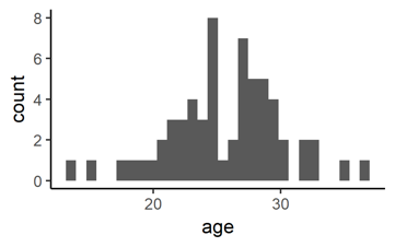
You can plot one of the variables, say age, as histogram:
# This plots a histogram of one continuous variable
ggplot(data = mydata,           # data = ... specifies how your data is called (‘mydata’)
       aes(x = age)) +      # aes(x = …) specifies variable on x-axis (‘age’)
       geom_histogram()     # + geom_histogramm() specifies that we want a histogram
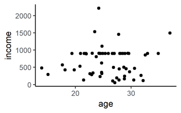
You can plot two measured continuous variables:
# This generates a point plot of two continuous variables
ggplot(data = mydata,               # (unchanged)
       aes(x = age, y = income)) +  # NEW: y = … specifies a y-variable (‘income’)
       geom_point()                 # NEW: +geom_point() means now we want points
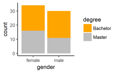
Next, think of your measured categorical variables, like gender, educational degree, or occupation, etc. You can plot how many participants fall into each combination of the gender-degree-combinations:
# Plot two categorical variables as colour-filled bars
ggplot(data = mydata,               # (unchanged)
       aes(x = gender, fill = degree)) +    # NEW: new x-variable and fill-with-variable
       geom_bar()               # NEW: we want bars
# Note that the y-variable is not specified. It is automatically computed by counting how many rows in your data fall into each gender-degree category. It also works of there are more than two categories.
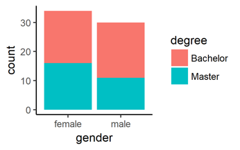
# Change the colours
ggplot(data = mydata,                   # (unchanged)
       aes(x = gender, fill = degree)) +    # (unchanged)
       geom_bar() +                         # (unchanged)
       scale_fill_manual(                   # NEW: scale_fill_manual() adds ourfilling colors
           values = c("orange", "grey"))     # define the color values
You can find a list of more colour names here.
2. Continuous Dependent Variables and Categorical Independent variable
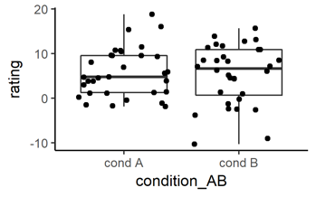
Next, think of an experimental design with a continuous dependent variable and experimental conditions, for example condition ‘A’ and ‘B’. Think of something like a 1 x 2 factorial between-subject design. To show if your continuous dependent variable changes given the levels of your categorical independent variable, you can use a side-by-side boxplot like this:
# This plots boxplots of a continuous variable given a categorical variable
ggplot(data = mydata,                           # (unchanged)
      aes(x = condition_AB, y = rating)) +    # NEW: new x- and y-variables
      geom_boxplot()                            # NEW: now we plot a boxplot
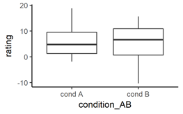
Note: this will also work if your categorical independent variable has more than two levels
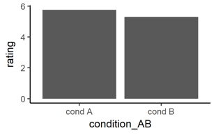
# Same data but only the mean values shown as bars
ggplot(data = mydata,                        # (unchanged)
       aes(x = condition_AB, y = rating)) +   # (unchanged)
       geom_bar(                             # NEW: now we want to plot bars
           fun.y = mean, stat = "summary")   # specify that top of bar = mean of y
# Same data as points with error bars representing standard deviation (SD)
ggplot(data = mydata,                       # (unchanged)
       aes(x = condition_AB, y = rating)) +    # (unchanged)
       geom_point(                          # NEW: now we to add points
           fun.y = mean, stat = "summary") +    # (unchanged)
       geom_errorbar(                          # NEW: we want to add error bars
           fun.ymin = function(z) mean(z)-sd(z),   # define minimum of error bar
           fun.ymax = function(z) mean(z)+sd(z),   # define maximum of error bar
           stat = "summary",
           width = .1)                          # makes it prettier
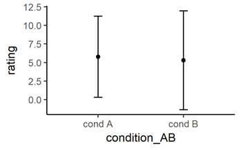
You can use the command ‘geom_errorbar(…)’ also for the bar plot shown above to add error bars to a bar plot. Try to copy all lines of the command ‘geom_errorbar(…)’ from the point plot, and add them with a ‘+’ to the barplot above.
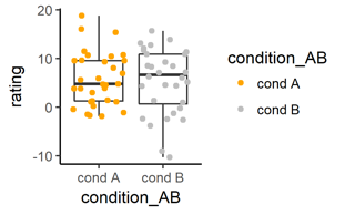
# Let’s go back to boxplots. Add the raw data in the background
ggplot(data = mydata,                          # (unchanged)
       aes(x = condition_AB, y = rating)) +   # (unchanged)
       geom_boxplot() +                        # NEW: we want the boxplot again
       geom_jitter()                     # NEW: we want to add jittered points
# Color the the raw data
ggplot(data = mydata,                           # (unchanged)
       aes(x = condition_AB, y = rating)) +    # (unchanged)
       geom_boxplot() +                         # (unchanged
       geom_jitter(                             # (unchanged)
           aes(color = condition_AB)) +   # NEW: specify color represents condition_AB
       scale_colour_manual(                 # NEW: define the colour values
           values = c("orange", "grey"))
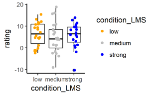
If your categorical independent variable has more levels, that’s no problem at all. All you need to change is to add more manual color values:
# The categorical independent variable ‘conditon_LMS’ has three levels
ggplot(data = mydata,
       aes(x = condition_LMS, y = rating)) +    # NEW: new x-variable with 3 levels
       geom_boxplot() +         # (unchanged)
       geom_jitter(
           aes(color=condition_LMS)) +      # NEW: new color-variable
       scale_color_manual(
           values = c("orange", "grey", "blue"))    # NEW: three colors
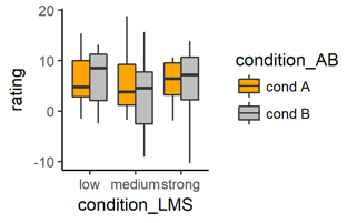
Next, think of a situation where you have two categorical independent variables, like one condition called ‘A’ vs. ‘B’, and another condition with for example time pressure ‘low’, ‘medium’, or ‘strong’. Think of a 2 x 3 factorial design. To display if a continuous dependent variable changes given the six different combinations of the conditions, you can use a side-by-side boxplot with different colors for the other condition, like this:
# This plots boxplots for each value combination of two categorical variables
ggplot(data = mydata,
       aes(x = condition_LMS,      # NEW: categorical x-variable
           y = rating,            # (unchanged y variable)
           fill = condition_AB)) +  # NEW: second categorical fill-variable
       geom_boxplot() +
       scale_fill_manual(           # (unchanged)
           values = c("orange", "grey"))
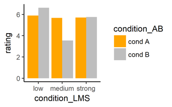
# Same data as bar plots with the mean of the y-values as height of bars
ggplot(data = mydata,                   # (unchanged)
       aes(x = condition_LMS,          # (unchanged)
           y = rating,             # (unchanged)
           fill = condition_AB)) +   # (unchanged)
       geom_bar(                # NEW: now we plot bars
           fun.y = mean, stat = "summary",  # NEW: end of the bar = mean y values
           pos = "dodge") +                 # NEW: put bars side-by-side
       scale_fill_manual(               # (unchanged)
           values = c("orange", "grey"))
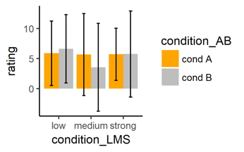
# Same bar plot with error bars
pos_dod <- position_dodge(width = .9)     # NEW: to position the bars correctly
ggplot(data = mydata,                      # (unchanged)
       aes(x = condition_LMS,              # (unchanged)
           y = rating,                 # (unchanged)
           fill = condition_AB)) +      # (unchanged)
       geom_bar(                           # (unchanged)
           fun.y = mean, stat = "summary",     # (unchanged)
           pos = "dodge") +             # (unchanged)
       scale_fill_manual(                  # (unchanged)
           values = c("orange", "grey")) +
       geom_errorbar(                   #NEW: add error bars
           fun.ymin = function(z) mean(z)-sd(z),    # define minimum of bar
           fun.ymax = function(z) mean(z)+sd(z),    # define maximum of bar
           stat = "summary",                # plot the summary
           width = .2,                  # make ends of bars smaller
           pos = pos_dod)                   # correct position of bars
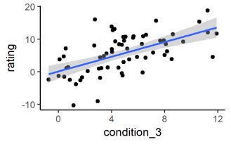
3. Continuous dependent variable and continuous independent variable
Think of a correlational design where you have manipulated e.g. stress level of participants and you measure some rating, both the dependent and independent variable are on a continuous scale. You can do a simple regression or correlation plot.
# Plot two continuous variables and a correlation/regression line
ggplot(data = mydata,
       aes(x = condition_3, y = rating)) +   # NEW: continuous x- and y-variables
       geom_point() +                    # NEW: we want points
       geom_smooth(method = "lm")            # NEW: we want a line
# “lm” means “linear model” since the correlation line is a linear line
# The grey area is the 95% confidence level interval for predictions from a linear model
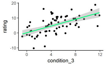
# Change the color of the line
ggplot(data = mydata,                       # (unchanged)
       aes(x = condition_3, y = rating)) +      # (unchanged)
       geom_point() +                           # (unchanged)
       geom_smooth(method = "lm",               # (unchanged)
           color = "springgreen")                      # NEW: define color
Suppose your experiment contains one continuous independent variable and one categorical independent variable (and a continuous dependent variable). To see if the relationship between the continuous variables changes for the levels of the categorical variable, you can plot two side-by-side correlation lines like this:
# Mixed design: continuous and categorical independent variables
ggplot(data = mydata,
    aes(x = condition_3, y = rating)) +    # (unchanged)
    geom_point() +                        # (unchanged)
    geom_smooth(method = "lm") +           # (unchanged)
    facet_wrap(~condition_AB)             # NEW: add the categorical variable
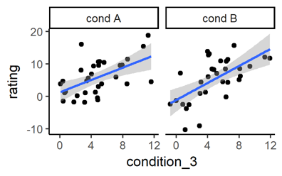
This will also work if your categorical variable has more than two levels.
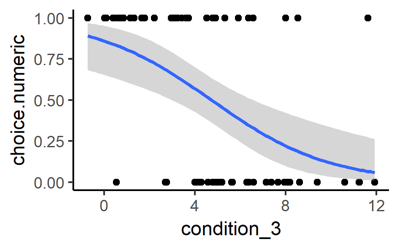
Finally, let’s consider a design with a categorical dependent variable and a continuous independent variable. If the categorical dependent variable has only two levels (think of ‘Option A’ and ‘Option B’), then you can plot a logistic regression line as follows:
# Categorical dependent variable with two levels
# transform categorical variable to have numeric values 0 and 1
mydata$choice.numeric <- as.numeric(mydata$choice) - 1
# Make the plot
ggplot(data = mydata,                           # (unchaned)
       aes(x = condition_3, y = choice.numeric)) +      # NEW: new y-variable
       geom_point() +                               # (unchanged)
       geom_smooth(method = "glm",              # NEW: “glm”
           method.args = list(family = "binomial"))         # NEW: plots a logistic regression line
4. Saving your plots
Saving plots is super easy. After you have generated the plot, you use the command:
# Save the last plot you generated
ggsave(“filename_of_plot.png”)
Then your plot will be saved as PNG file with the name filename_of_plot. The file will be saved in the same location where your R code is. If you want to save the plot to a different location simply type your personal path to the folder, which should look similar but different from this:
# Add a longer file path if you want to save to a different location
ggsave(“C:/Users/.../Folder/Folder/filename_of_plot.png”)
# If you need a JPG or TIFF file, just type:
ggsave(“filename_of_plot.jpg”)
ggsave(“filename_of_plot.tiff”)
# If you want a different size use
ggsave(“filename_of_plot.png”, width = 8, height =5)
# If you want the font to be bigger, use ‘scale = …’
ggsave(“filename_of_plot.png”, scale = 0.8)
Lizenz
University of Basel
Downloads